Spatial interfaces break the assumption every flat design system is built on: that the screen is a plane and the user is looking at it straight on. Depth stops being a stylistic choice and becomes the primary way hierarchy is communicated — and almost nothing from a decade of flat-design convention transfers cleanly.
We've shipped three spatial prototypes in the last eighteen months, for a surgical-training client, a logistics floor-planning tool, and an internal visualization product. Each one taught us the same lesson from a different angle: the hard part was never the rendering. It was relearning what hierarchy, feedback, and affordance mean when the canvas has a third axis.
Depth is hierarchy, not decoration
In a flat layout, weight comes from size and contrast. In a spatial one it comes from distance, occlusion, and how light falls across a surface. The same component reads as primary or secondary depending on where it sits relative to the viewer.
- Distance carries importance — closer surfaces read as more urgent.
- Occlusion resolves ambiguity faster than a drop shadow ever did.
- Lighting models have to be consistent, or the scene stops feeling real.
- Motion needs mass: things that stop instantly read as broken.

Where the effort actually pays off
Cut process waste before adding polish
Most spatial prototypes die in review because the team spent its budget on lighting instead of on the one interaction the product is judged by.
Prototype the hardest gesture first
The interaction that is hardest to make feel right is the one that decides whether the product ships. Build it before the surrounding shell exists.
Test on the target hardware early
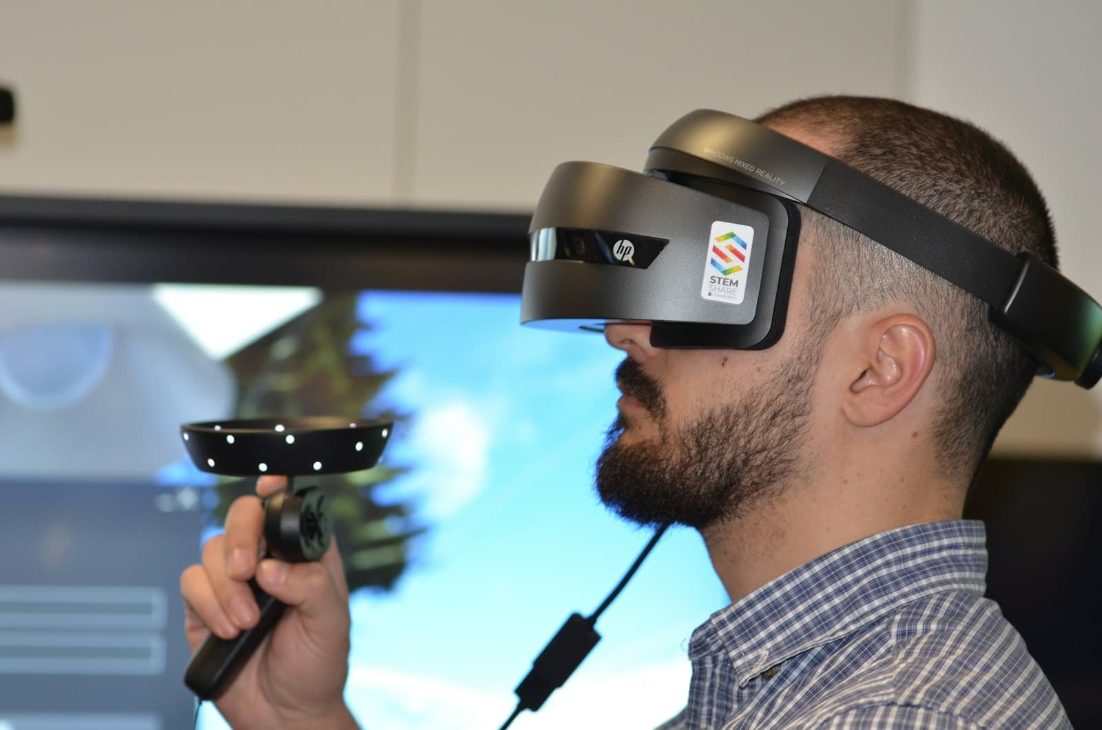
Headset ergonomics, field of view, and frame budget invalidate desktop-preview decisions faster than any usability finding.
Material and light are part of the interaction model, not set dressing
In a flat UI, a button's affordance comes from a border, a fill, and a hover state — three cheap signals a designer places deliberately. In a spatial one, a surface's affordance comes from how it catches a light source that is also lighting everything else in the scene. Get the lighting model wrong and every surface in the product looks simultaneously interactive and inert, because the cue the user is reading unconsciously — does this catch light the way a pressable thing would — never resolves.
- Pick one light source and keep it fixed relative to the user, not the scene — a light that moves with camera rotation reads as broken, not atmospheric.
- Specular highlights are the fastest 'this is interactive' signal available; matte surfaces should be reserved for content that is explicitly not actionable.
- Shadow falloff needs to be consistent across every component or the depth hierarchy starts lying — a component with a harder shadow than its neighbor reads as closer even when it isn't.
A note on accessibility
Depth cues are not available to every user. Anything communicated by distance or parallax needs a second, flat channel — text, order, or contrast — or the interface silently excludes people. Vestibular sensitivity is the other failure mode that gets missed in review: parallax and camera motion that feel subtle to a seated reviewer on a desktop preview can trigger real discomfort inside a headset. Every spatial prototype we ship now includes a 'reduced motion' mode that collapses camera-driven parallax to simple fades, tested by someone who was not on the team that built it.
In closing
Spatial design rewards restraint. The teams shipping the most convincing work are not the ones using the most depth — they are the ones using it for exactly one job, keeping the lighting model honest, and leaving the rest of the interface calm.